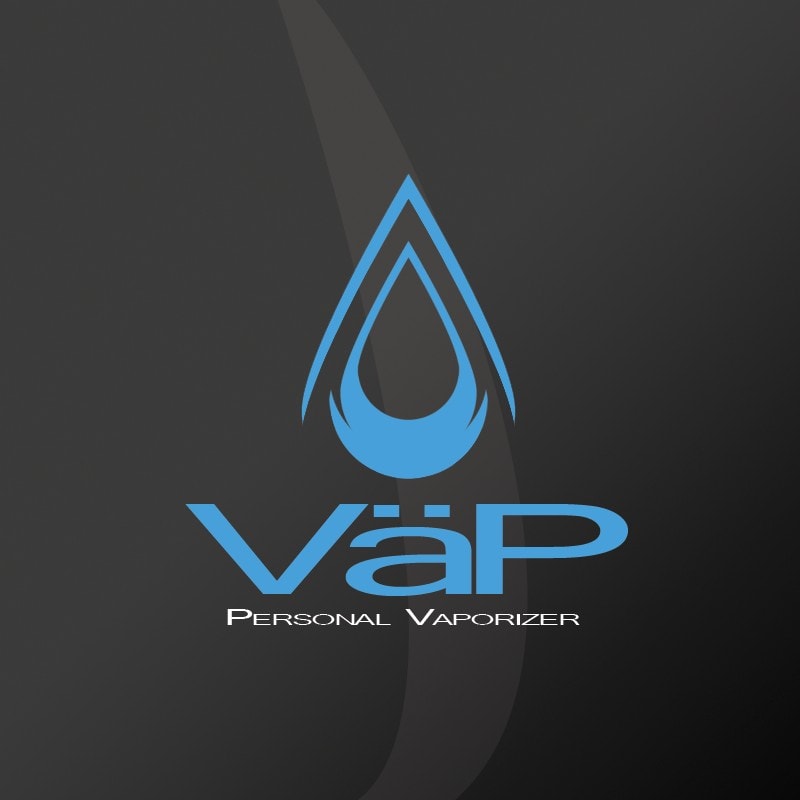
VaP - Personal Vaporizer Logo Design
Symbolic logo design for one of Canada's first electronic cigarette brands, featuring flame-inspired shapes and water vapor symbolism.

Logo Design for Canada's E-Cigarette Pioneer
VaP Personal Vaporizers was among the first electronic cigarette brands to enter the Canadian market, requiring a distinctive logo that would establish their identity in an emerging industry. The challenge was to create visual symbolism that would differentiate their vapor-based product from traditional smoking.
Design Concept
Flame-Inspired Shape: The logo's primary form evokes the familiar shape of a flame, creating connection to the smoking experience while introducing innovation.
Blue Color Psychology: Rather than traditional fire colors, the blue palette was chosen to represent the clean, cool vapor produced by e-cigarettes - a visual departure from heat and smoke.
Symbolic Meaning: The combination of flame-like form with water-inspired coloring created a sophisticated visual metaphor for delivering familiar ritual without harmful combustion.
Market Positioning: Positioned VaP as a credible alternative in a skeptical market while differentiating from generic or medical-looking competitor branding.
The VaP logo successfully established memorable brand identity during the early days of the Canadian e-cigarette market, using familiar visual cues with new color associations to bridge traditional smoking culture and innovative vaping technology.
Categories
Project Gallery
Technologies Used
Key Features
- Symbolic flame-inspired design
- Blue color palette representing vapor over smoke
- Scalable vector logo for all applications
Results
Related Projects
Lions Professional Center - Logo Design
Professional logo design for a newly opening professional office center, emphasizing strength and professionalism for the business community.
Okotoks Pizza - Brand Identity & Logo Design
Complete logo design and brand identity for a newly renovated pizzeria under new ownership, establishing fresh visual identity for the local Okotoks community.
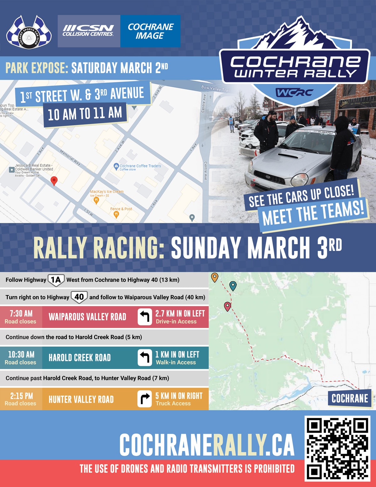
Calgary Sports Car Club - Rally Graphics
Graphic design work for Calgary's premier motorsports organization, including event promotional materials and brand identity for rally test days.
Like What You See?
Let's create something amazing for your business too.